
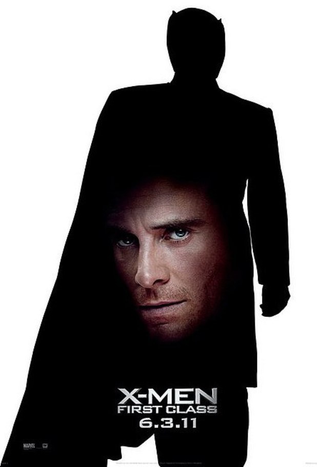
I chose this as a failure in design because I feel it was too simplistic.
To put the head of a person on a silhouette explains very little on who
the person is suppose to be. Its in a stressful state because of the placement
of the head. The silhouette doesn't do much for the poster. That could be
superman with a bad haircut. The head is a eyesore. All that it tells me
is that he must be one of the x-men. It makes the picture imbalance with
head taking up most of the right side of the poster.
No comments:
Post a Comment